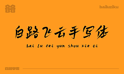
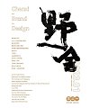
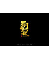
According to the size of brush strokes of mark pen to control the architecture of the font, font style of the whole center of gravity is steady, every word are the size of the brush strokes of change, make the font more dynamic, can be widely used in the headword in the layout of joy, and the traditional blackbody is slightly different, more flexibility in the tradition of handwritten, used in plate headline does not appear too stiff and not too active. Stroke ratio close to the golden ratio, the size of the each type according to the different font size stable center of gravity to determine the brush. The most thick brush strokes and fine brushwork form strong visual contrast, look have aesthetic feeling, because time relationship, to make a little poor. Any good change opinion please say… (font do less, just some ideas)


-

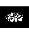
Chinese Creative Font Design-Selected Design of Small Fresh Fonts
-
16P Chinese traditional calligraphy brush calligraphy font style appreciation #.2138
-

10P Creative Chinese font logo design scheme #.1862
-
15P Inspiration Chinese font logo design scheme #.947
-
4P Creative Chinese font logo design scheme #.395
-
22P Creative Chinese font logo design scheme #.422
-
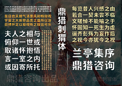
25P Collection of the latest Chinese font design schemes in 2021 #.662
-
8P Chinese traditional calligraphy brush calligraphy font style appreciation #.691
-
15P Chinese traditional calligraphy brush calligraphy font style appreciation #.1502
-
15P Chinese font design collection inspiration #.228